
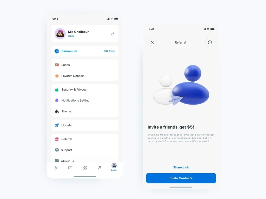
Three decisions. Each one had a wrong answer that was easier to build.
Entry point: transaction success screen, not the home banner. The initial proposal was a persistent home screen banner. Easy to build. Also easy to ignore. I pushed for the transaction success screen instead. Someone who just completed a payment is about as happy with the app as they're ever going to be, and that felt like the right moment to ask. After launch, the CTA on that screen had a 22% tap rate. The profile menu, which we also tracked, got 4%. Five times the performance. Not a close call.
THE SHARE MECHANIC
I went with the native OS share sheet and a pre-populated Farsi message over a custom contact picker. The custom version looked better in Figma, honestly. More branded, more controlled. But it added two extra taps and needed a contacts permission nobody wants to give. The native sheet got people to Telegram or WhatsApp in one tap. That's where they were going anyway. I wrote the pre-populated message to sound like something a real person would send, not a press release. Went through five versions before landing on one that didn't feel like advertising.
Tiered rewards vs. flat. The PM wanted flat rewards: one credit per referral, no cap, no tiers. Simpler to explain and simpler to build. I pushed back. Flat unlimited rewards on a platform this size attract coordinated fraud. It's not a hypothetical, it's predictable. A tiered structure gives you two things: it caps the liability the compliance team needs to model, and it creates milestone moments at the 3rd and 5th referral that give people a reason to keep going. The cost was complexity. Tiered rewards only make sense if users can track their progress, which meant building a dashboard, which turned out to be the hardest part of the whole project.
The referral dashboard wasn't a feature. It was a trust mechanism. Users had to believe the system was tracking their invites accurately before they'd bother sending another one.
The dashboard had six states per referral: sent, installed, activation pending, activated, reward pending, reward credited. Each one carries a different emotional weight. Waiting feels different from confirmed. Pending looks different from failed. I designed the empty states, the tier progress ring, and the notification copy for when a referral went through. I also covered the edge cases: self-referral on the same device, invites that expired after 30 days, someone trying to refer an existing customer. Each one needed a message that was honest without sounding like an accusation.
There was one infrastructure problem I couldn't design around, only design for. Universal links don't behave reliably in Iran's network environment. A flow built entirely on deep links would silently lose attribution for a portion of every share. So I built a fallback. When the link fails, users land on the App Store and see a screen that explains what happened, then shows the referral code right there. It had to feel like an alternative path, not a broken one.
CHOSE | CUT | BECAUSE |
|---|---|---|
Transaction success screen entry point | Persistent home banner | Peak satisfaction moment. 22% tap rate on this screen vs. 4% on the profile menu. |
Native OS share sheet + pre-populated message | Custom in-app contact picker | Reached Telegram/WhatsApp in one tap. Custom picker added two taps and a permission flow. |
Tiered rewards with milestone bonuses | Flat unlimited reward per referral | Flat rewards create uncapped fraud exposure at 4M+ user scale. Tiered structure caps liability and creates engagement hooks. |
Manual code fallback on App Store landing | Deep-link-only flow | Universal links are unreliable in Iran. Failed links silently drop attribution. Users stop sending invites when they see no reward coming. |
What happened in the first two quarters after launch?
86KNew accounts activated through referral · Q3 to Q4 2022 | 27%Invite-to-account-activation conversion | +31%90-day retention vs. paid acquisition cohort | 19%Share of monthly new-user acquisition by end of Q4 |
The number that actually moved the business conversation wasn't the 86,000. It was retention. Referred users stayed 31% longer at 90 days than the paid acquisition cohort from the same period. A recommendation from someone you already know does something no ad can: it sets realistic expectations before you open the app, and it gives you a real person to ask when you get stuck. We hit 19% of monthly new-user acquisition from referral, against a 15% target. The growth team started scoping the next phase before Q4 was over.